Achieving product-to-market fit in biotech
goBalto (Oracle) clinical study startup + SaaS + startup + innovating in regulated industries
The problem
Before goBalto Activate, specialists who recruit investigators (physicians) and patients for clinical trials used spreadsheets to track progress and secure email to exchange documents and messages.
Each Friday, specialists compiled status reports which were rolled up into organization reports. By the time managers received status updates, the data was old and of little use for remedying bottlenecks and delays.
goBalto sold itself as the “TurboTax of clinical trials” because of the wizard-driven experience which was user tested with managers, decision makers, and select employees.
Soon after releasing goBalto to pilot clients, we learned it wasn’t producing the promised time savings. We needed to deliver the efficiencies promised, so large companies would convert to long term contracts.
The goBalto product story
My contribution
Role: VP of UX and Product
Build and manage a team (experience and visual designers, researchers, and UX writers)
Resolve complaints from early adopters
Increase engagement
The strategy
We conducted on-site observations (contextual inquiries) in the US and Europe and:
Learned the varied work styles and processes
Conducted participatory design sessions to learn user preferences
User-tested potential solutions, watching for success and failure
Plotted the user journey to identify points of friction where goBalto failed to effectively support the work
What we learned
Europeans didn’t like how goBalto over-simplified the work (they wanted more challenge)
Americans appreciated goBalto’s simplicity
All specialists wanted to make personal decisions about how, and in which order, they perform the work
Specialists prefer information displayed in grids that help them see and do many things at once
Specialists constantly tracked key milestones and deadlines and feared delays
Most specialists tracked status of projects and key tasks with post-it notes on their cubicle walls
Even with goBalto they:
continued to keep information in spreadsheets so they could quickly update many records at once.
transferred the spreadsheet data into goBalto at the end of the day (this worked against the goBalto brand promise of making real-time status available for managers)
Solutions
Tip: click screenshots to display a larger version
We embraced a UX vision that encourages the use of patterns that display milestones and allow specialists to perform tasks from the home page (singularly and in bulk).
This eliminated the time and frustration associated with having to navigate to various pages to work on multiple investigators. Because specialists often task-shift, now they never have to leave the current page to view or input data for different investigator.
To ensure that we didn’t overwhelm the home page with unimportant data, we designed and tested various layouts that were based on learnings from the participatory design sessions.
We added a timeline that highlights the status of key activities and deadlines; this replaced the sticky notes that specialists often put on their cubicle walls.
Work from the home page
Before goBalto, investigators (physicians who enroll their patients in clinical trials) sent hundreds of pages of documents to pharma companies by mail, courier, and fax. The process often involved months of sending documentation for the specialists to review with lots of emails and calls exchanged to request or ask questions about submissions.
We built this portal where investigators can see all the documents required and their status. As new documents or previously-submitted documents needed to be submitted, we sent email alerts to sites and also displayed those alerts on this simple one-page experience.
A timeline of milestones
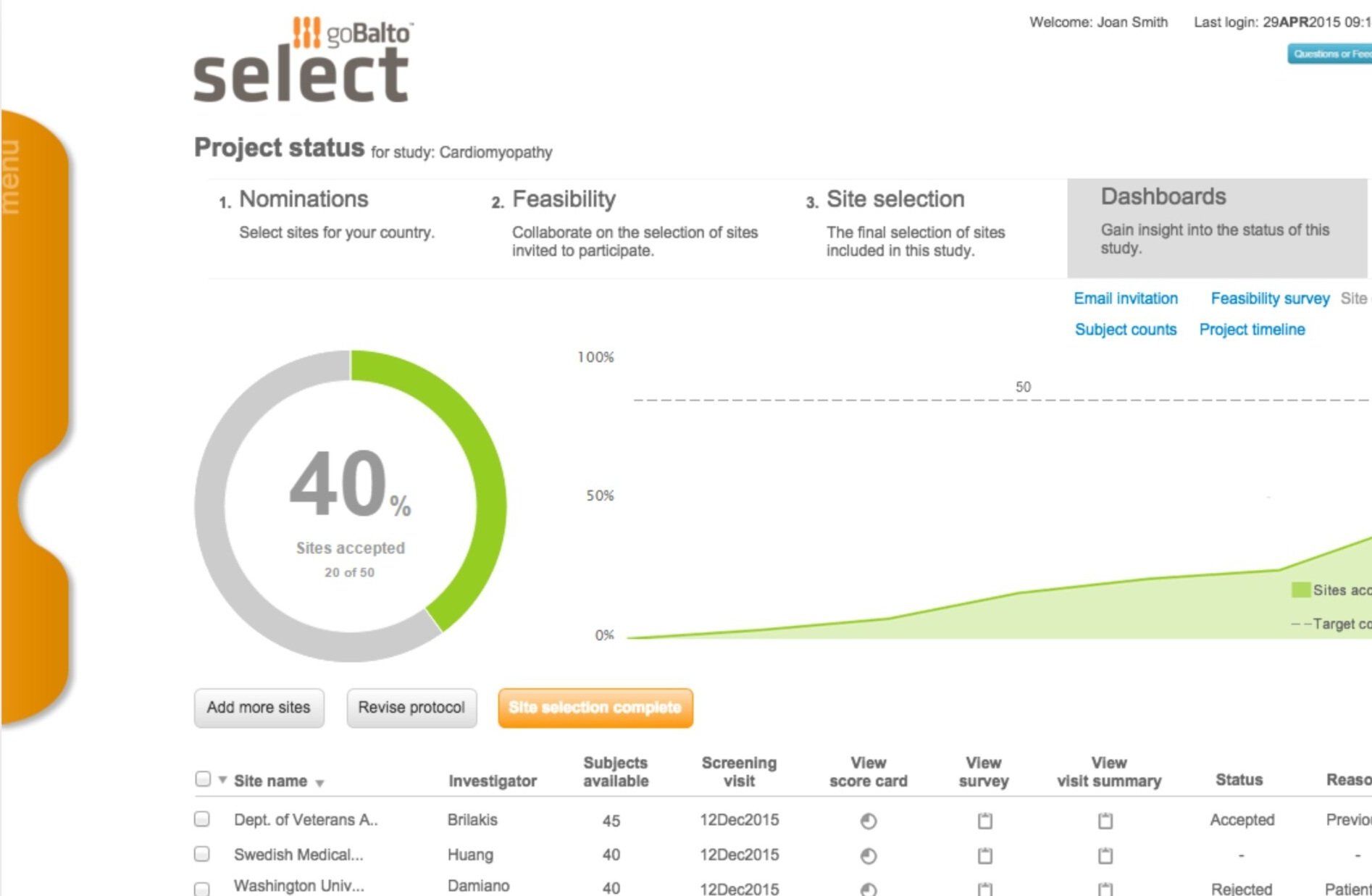
We then extended the “working from home” and milestone tracker concepts to other goBalto products (Select, a site selection tool, and Analyze a reporting tool).


