Reducing friction with content-first design
Calendly + SaaS + B2B + B2C + content-first design + design-led growthThe challenge
Calendly launched a new workflows feature and hypothesized the capability would increase engagement and help users automate activities they perform before, during, and after meetings.
For the feature to be a success, users must be able to:
discover the workflows functionality,
understand the value,
easily set up, and
trust that the outcome aligns with their goals and expectations.
My contribution
I was hired as Director of Content Design, to:
build and lead a team of content designers who also conduct research and lead ideation sessions for enhancements
introduce design-led growth, storytelling, and content-first practices
collaborate with UX to envision and execute a UX strategy
help increase adoption and engagement
The approach
1
2
3
4
Content Design created and documented the UX and messaging strategy
We start with a brief that articulates the business and user goals, and stakeholders. It also articulates existing insights, research questions, and a summary of the strategy. This helps ensure we properly frame the problem and keeps the team (Design, Content, Product, etc.) on the same page.
We conducted heuristic reviews of the initial release
This gave us clues about the obvious issues to resolve.
We usability tested the existing experience
We discovered many users didn’t know what workflows are, their value, or understand the concepts and terms used.
We researched new terms and concepts
We explored alternative terms and concepts, and then tested them with non-Calendly users.
This was the initial experience (before my team’s involvement). Users didn’t really understand “workflows” and what is being automated.
The legacy terminology (“triggers” and “variables”) didn’t resonate with many users, so they couldn’t set workflows up.
Users were unsure how to manage workflows.
5
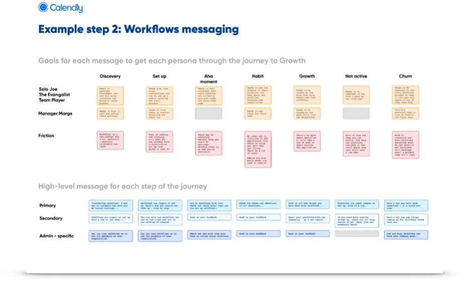
We designed a messaging funnel
Just like marketing messaging that’s strategic and intended to drive users from awareness through to engagement, we used a similar technique to introduce and drive new users to engage.
This allowed us to incrementally inform users about what they need to know to discover, understand, and get value so the team could realize engagement goals.
The messaging funnel articulates the strategy to influence and inform (not teach) thereby reducing cognitive load and friction.
6
We created stories about excellent user experiences…
“Meet Jeff the sales rep
One day while in Calendly, he’s informed that Calendly can automatically send email and text messages before, during, and after meetings.Jim finds this intriguing
Just last week he had 3 “no shows”. As a seasoned salesperson, Jim knows “the more meetings, the more deals”.Jim wants to understand how it works
So he watches a short video and learns all he has to do is answer a few short questions and he can test everything by sending the messages to himself!So Jim sets up a workflow…
He immediately receives an email confirmation message. The day before his “test meeting” he receives a text message, and the day after he receives a thank up email…just as he set up.Now that he understands and has confidence using workflows, Jim sets them up for all the types of meeting he offfers.”
7 We then designed and wrote content and tested new experiences based on the compelling stories
8 And finally, we released and tracked metrics
The solution
We added messaging to set user expectations and reinforce the value
We implemented Braze notifications to bring attention to workflows from the home page and also provided a video of the value prop.
We added a description of the value of using workflows to the landing page
We addressed the issue of the required subscription level and allows users to try it before upgrading
We offered pre-made templates with descriptions to lessen setup friction and further reinforce the mental model
Workflow video
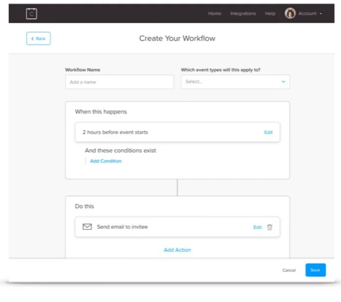
We introduced a format that illustrated the structure of a workflow’s parts
We eliminated technical jargon
We visually show the relationship between elements
To help users understand the concept of variables, we created.a help video and showed visually how they can work
What’s a variable video
The result
Within the first 20 days after release, users who tried the new workflows feature increased by 65%
47% more users who started workflow setup, completed the process.


